I've worked on four rebrands while at Fenwick. The last rebrand was completed in early 2016. The style evolved from an email redesign that was based on Microsoft's Metro style. Beginning with the logotype, color palette and typography, I developed the new styles and then applied it to all the marketing materials, including presentations, proposals, pitches, client-facing and internal email, event materials, environmentals, signage, brochures etc. The goal of the redesign was to visually reinforce the concept of Fenwick as a distinctly different kind of law firm with an optimistic color palette and modernist styles, balancing aspects of a open, fun place to work for attorneys, but also a serious and successful firm to potential clients. Fenwick's clients are a who's who of Silicon Valley and I tried to speak in a familiar visual language to them using this style.

Color palette
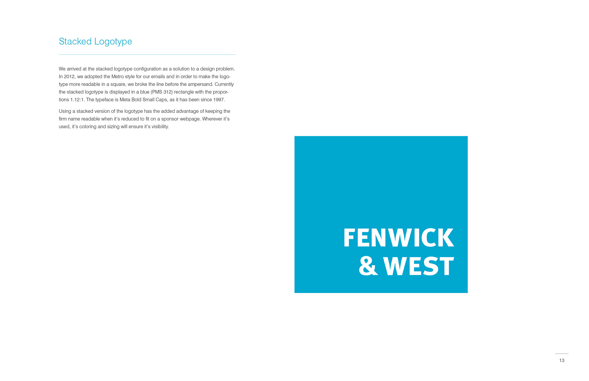
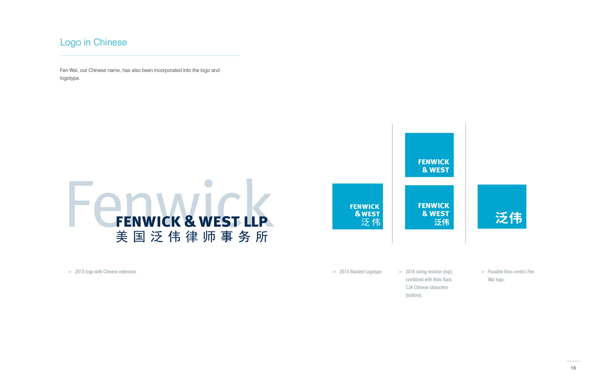
Logotype
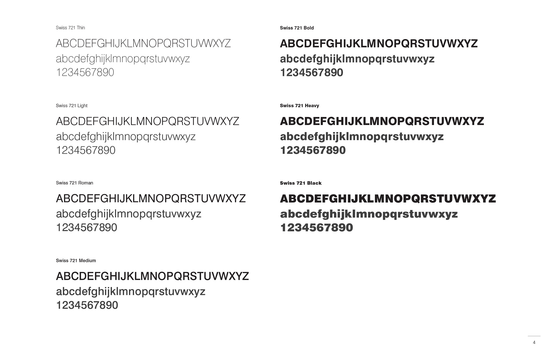
Swiss 721
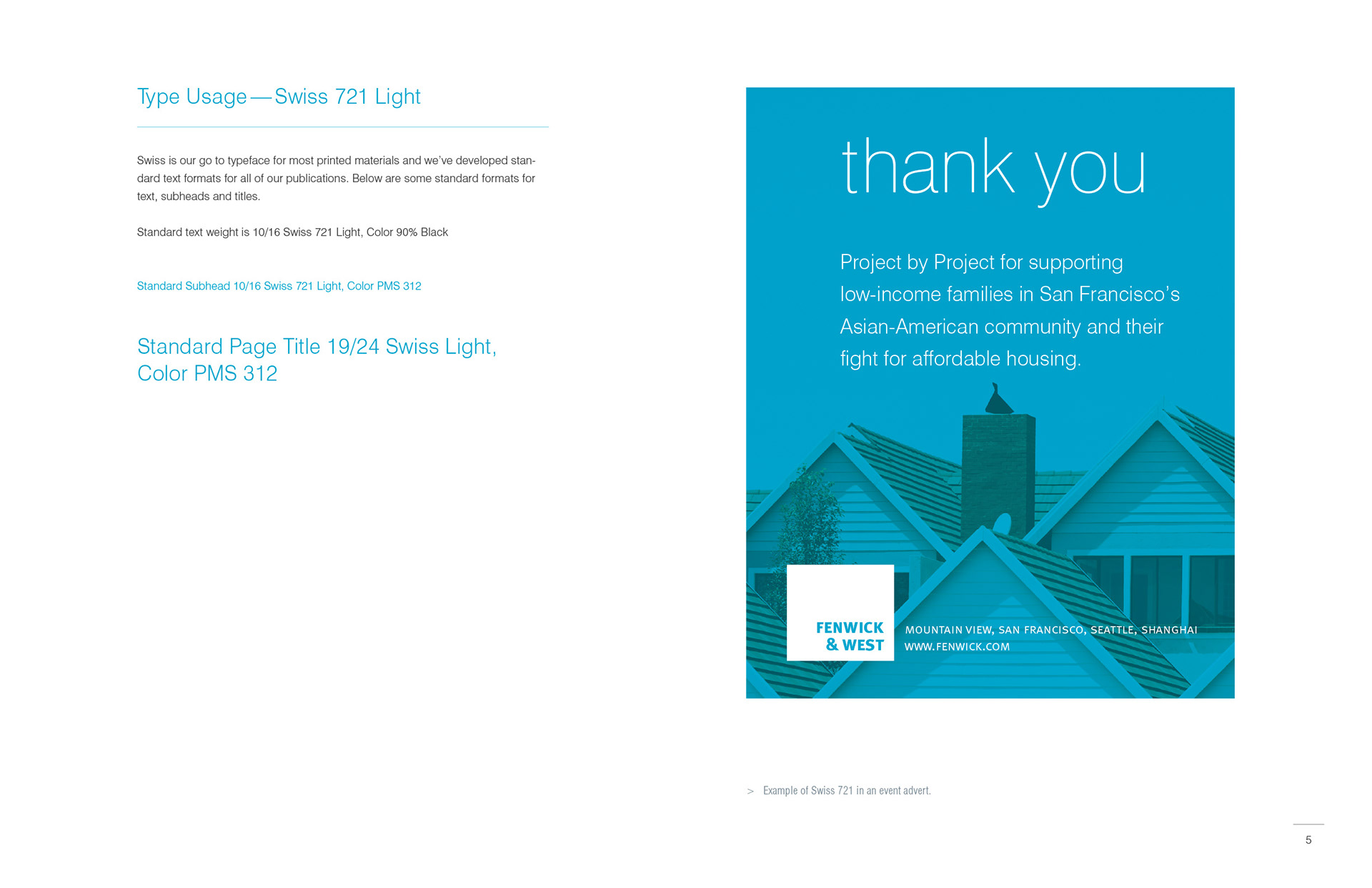
Text type usage
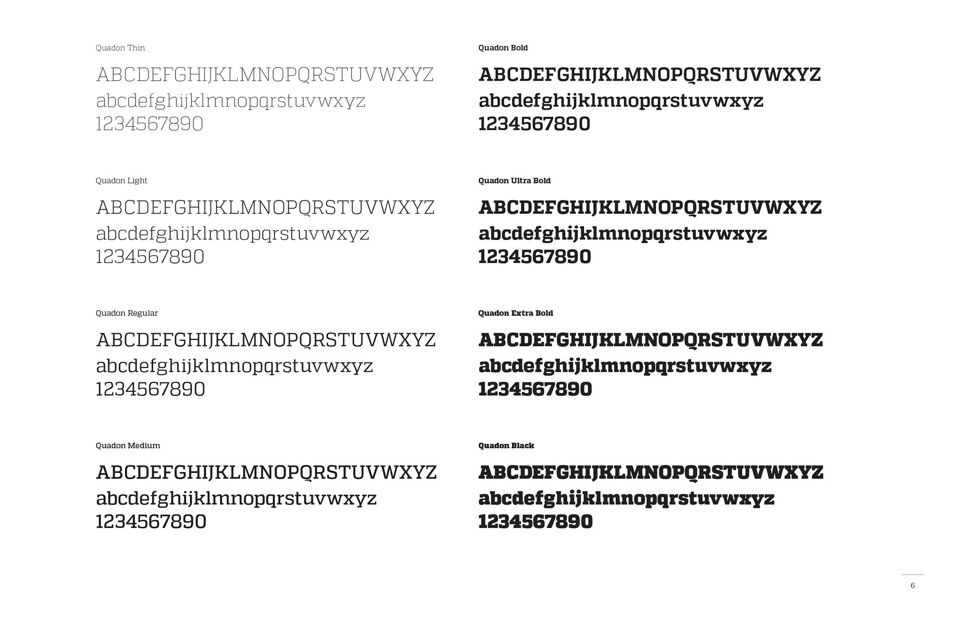
Quadon display type
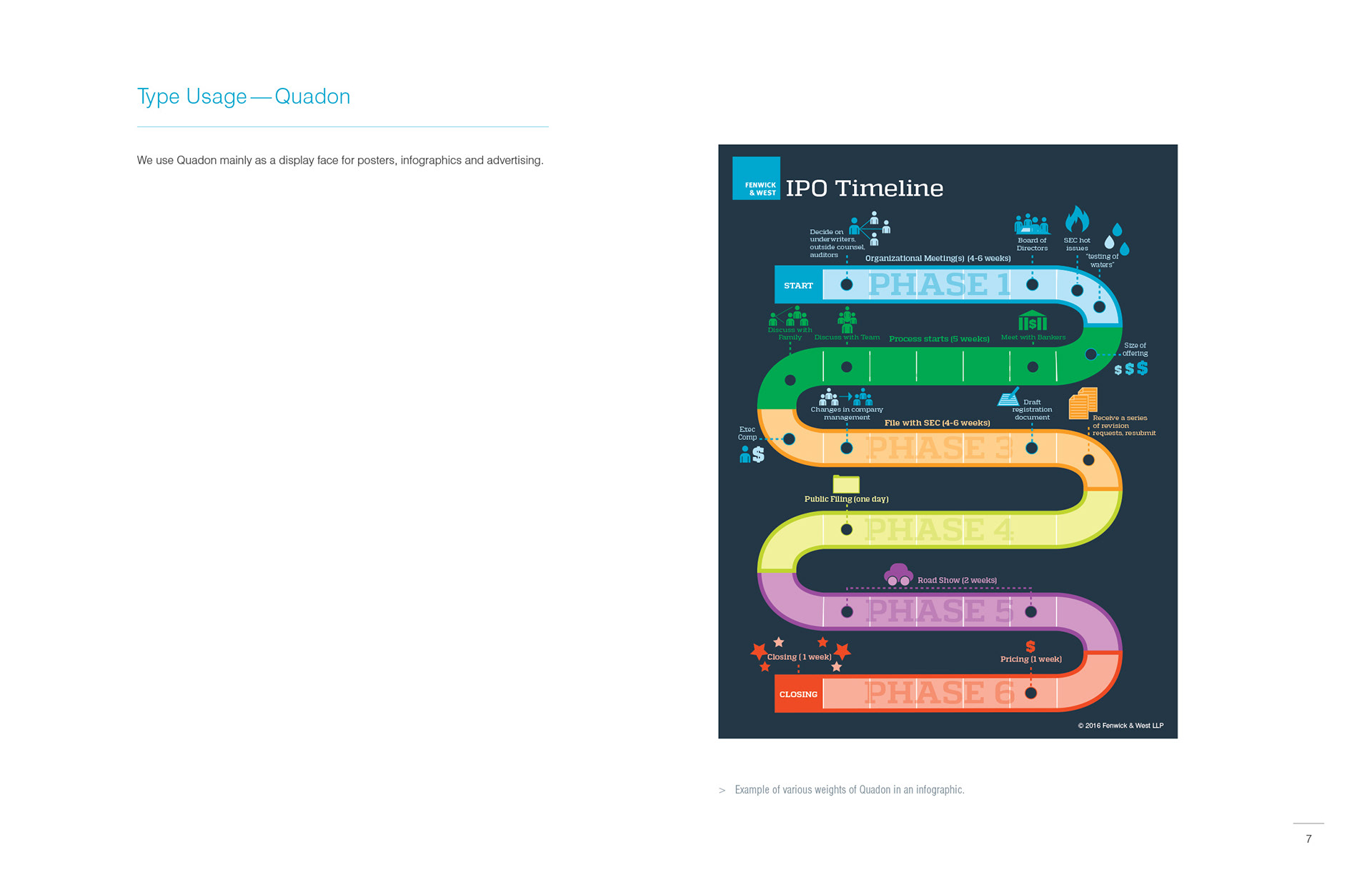
Display type usage